Elements of a Great Company Logo
What is the first thing you recall when you think of a popular brand? More than likely, you will recall their logo. When you think Nike, their signature “swoosh” usually comes to mind. What about McDonalds and their golden arches? By definition, a logo is a symbol or design that is used to describe a company. A logo is a powerful branding tool that every company should have. Not only is a logo the first step in creating a brand image for your company but it also creating a strong statement which will make your brand stand out. There are a few elements that you should consider when trying to create an effective logo for your brand.
Simplicity
Overcomplicating a logo design is a common mistake among ammeter designers. An effective logo design should be simple and easily recognizable by your customers. This is part of the reason why minimalistic designs have become so popular in recent years. It is likely that Apple helped to popularize this trend with its plain, simplistic branding.
When creating a logo for your company, you want to choose a design that properly represents your brand but also identifies with your target audience. Adding too much bloat to your design will make it difficult for customers to remember your logo. Notice how the above logos use a single shape and color to represent their brand. Their logos are so memorable that they don’t even need to use their name and you still know exactly who they are. While this level of brand recognition takes some time to build, it doesn’t hurt to set yourself up with a logo that follows the same principal.
Timelessness
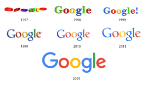
While you want your design to look just as modern as your contemporaries, create a design that can easily evolve over time. You may have noticed popular brands making slight updates to their logos over time. For instance, look at the evolution of Google’s logo. While the current logo looks a lot different from their original 1997 design, each update to their logo has been more-or-less a variation of the same design. Instead of rebranding your company every time you start to feel like your brand image is getting stale, create a logo that can be revised and updated over the years so your branding can always stay consistent.
Color
While graphic design and psychology rarely intersect, choice of color can actually be used as a tool to drive an emotional response. You may not have realized this before but many companies knowingly use specific colors to subconsciously convey a meaning. Here are some common colors and what they are represent:
- Red – Passion, Intensity, Love, Hunger
- Yellow – Optimism, Cheerful, Warmth, Clarity
- Orange – Excitement, Enthusiasm, Friendliness
- Purple – Creative, Wise, Royalty, Imaginative
- Blue – Trust, Strength, Peace, Serenity
- Green – Growth, Health, Eco-Friendly
- Gray – Neutral, Balance, Calm
For more information about the psychological affects of color, take a look at this infographic.
Versatility
A truly powerful logo should be just as effective in grayscale as it does in color. Design your logo with versatility in mind. Would your logo look terrible in all white on a black t-shirt? You may want to simplify your design. Most successful brands have many different variations of their logo so it can be used on billboards, brochures, clothing, pens, etc. Creating a logo without versatility will greatly limit your opportunities for extended branding in the future.
Dallas Riffle Media is Cleveland’s top branding and graphic design firm. We offer custom full-service marketing packages that include brand design, graphic design, web development, video production, photography, illustration and more. Give us a call at (216) 245-0835 or send us an email for a free brand consultation.
