That’s the Power of Originality
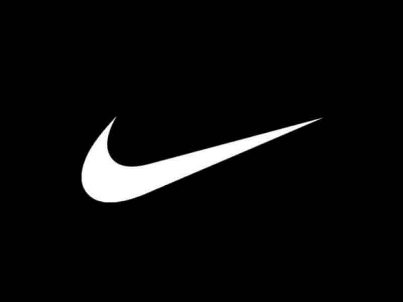
We all know this iconic brand element. No name necessary.
Since 1971, this has been one of the most recognizable corporate ID’s in the world. And in my estimation, the single most copied.
It’s nearly impossible to pull a random sampling of five modern brands without at least one of them incorporating some version of the Swoosh.
However, there’s generally a big difference between Nike’s usage of their Swoosh and, say, Capital One’s usage of theirs: for Nike, it actually MEANS something. It’s about speed. It’s about fluid motion. It’s about the strength and grace of the athletes that wear the equipment. For Capital One, it’s about the fact that they couldn’t come up with anything better. Of course, when you can’t come up with anything better, the answer is all too obvious: slap a swoosh on it. Done.
It’s like a virus among those that create corporate ID’s. From the biggest marketing agencies down to your nephew who has a hacked version of Photoshop and designed your Etsy store logo for $10 and a six pack of Milwaukee’s Best. Swooshes are slapped on hundreds– nay– THOUSANDS of logos a day. And if one swoosh doesn’t work… slap, slap, slap. Add a few more. I can hear it if the room gets quiet enough. And it gives me a dull headache.
The swoosh has been done, people. Move on. If you’re looking for an abstract logo, try this: put some serious thought into what your brand means or is to your clients/potential clients. Sure, you could give your own meaning to the swoosh if you tried hard enough, but for the same amount of effort, you could likely create something fresh, that is truly representative of what you’re selling.
But it’s not just logos… taglines, too, suffer from the scourge of bandwagon jumping. And there’s a new one hogging the well-worn marketing trail as we speak.
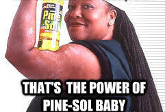
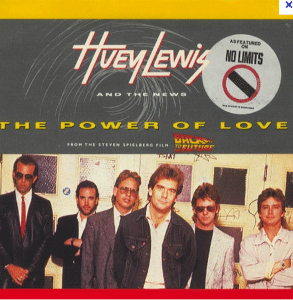
I’m sure many of you remember this (circa 1993):
Great! Original, succinct, apropos.
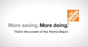
Well, sometime in the past decade, The Home Depot decided they were powerful as well (although they declined to hit on the audience in the process).
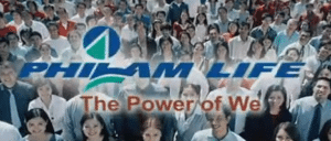
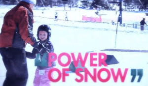
From there, it was a veritable avalanche of power. Observe:
…just a small sampling of the onslaught of POWER currently rocking the industry to its core.
So if you’re out of ideas, and you feel your fingers approaching the top row on your keyboard, STOP… refill your coffee and remember that if everything is powerful, then nothing is powerful. The same advice for logos applies here as well. Get to the essence of your brand and let it guide you.
Oh, and while you’re at it, pop this on your iDevice of choice:
And now, I must be going. I have a hankering to sit back and watch Marty McFly harness 1.21 gigawatts of pure… well, you know.
